CSS list style (2)
CSS list styling
Repository files
PDF files
| Converter | Status | PDF Preview |
|---|---|---|
| PDFreactor |

|

|
| PrinceXML |
|
|
| Antennahouse |
|
|
| Weasyprint |
|
|
| PagedJS |
|
|
| Typeset.sh |
|
|
| Vivliostyle |
|
|
| BFO |
|
|
OK
.svg) OK with issues
OK with issues
 Error
Error
 Unsupported
HTML input
<html>
<head>
<link rel="stylesheet" type="text/css" href="../styles/a4.css" />
<link rel="stylesheet" type="text/css" href="styles.css" />
</head>
<body>
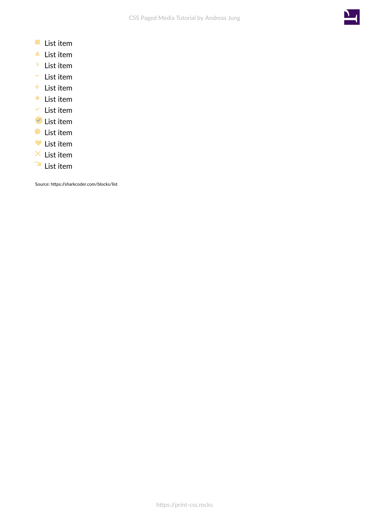
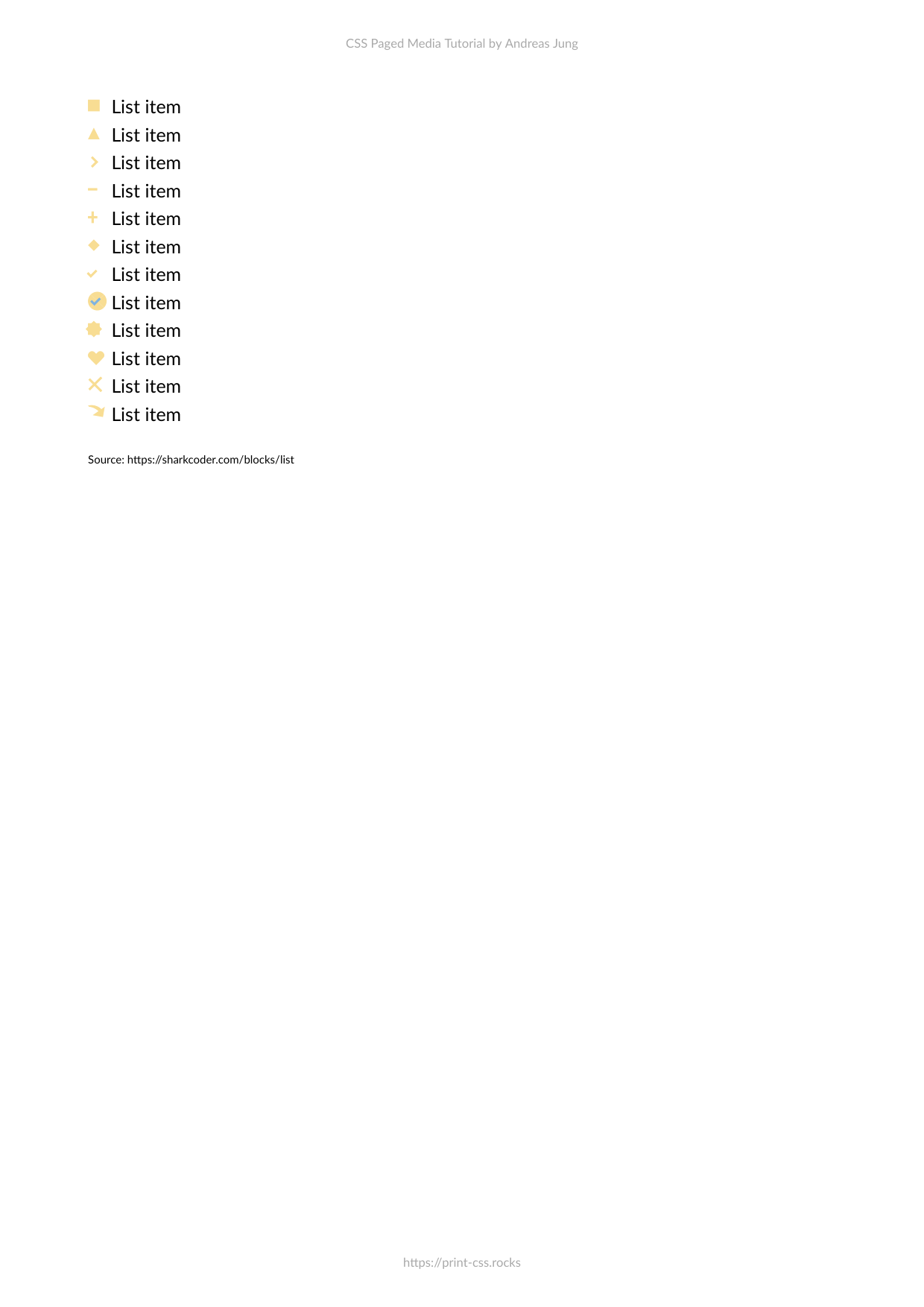
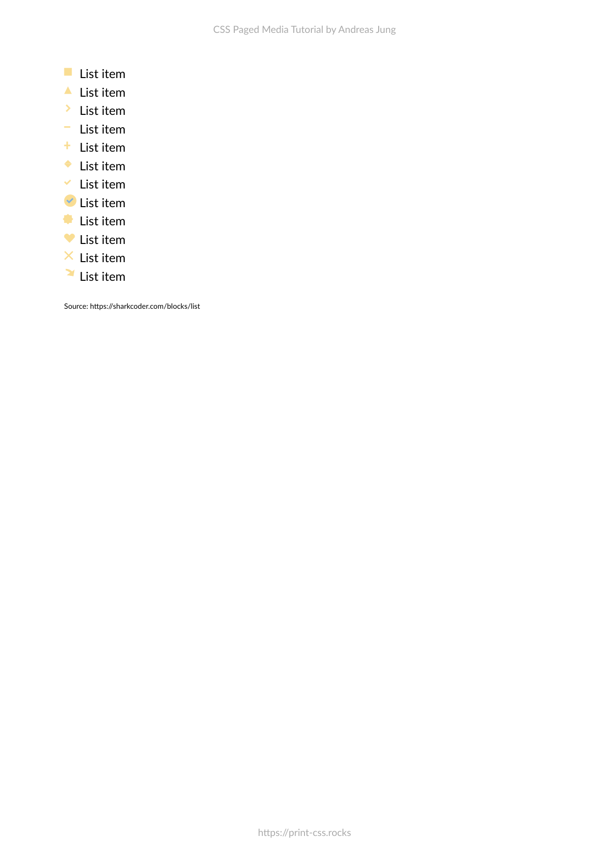
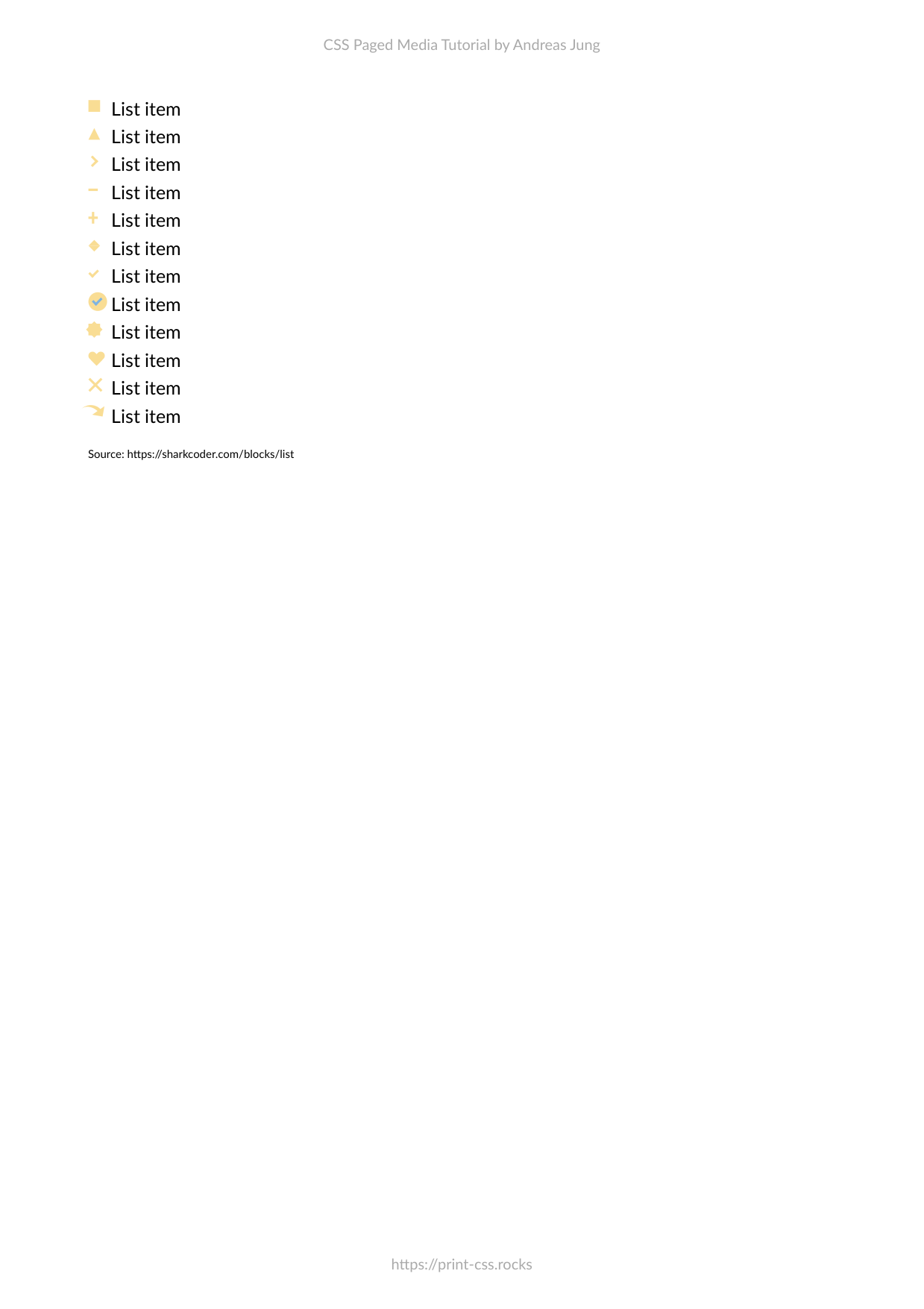
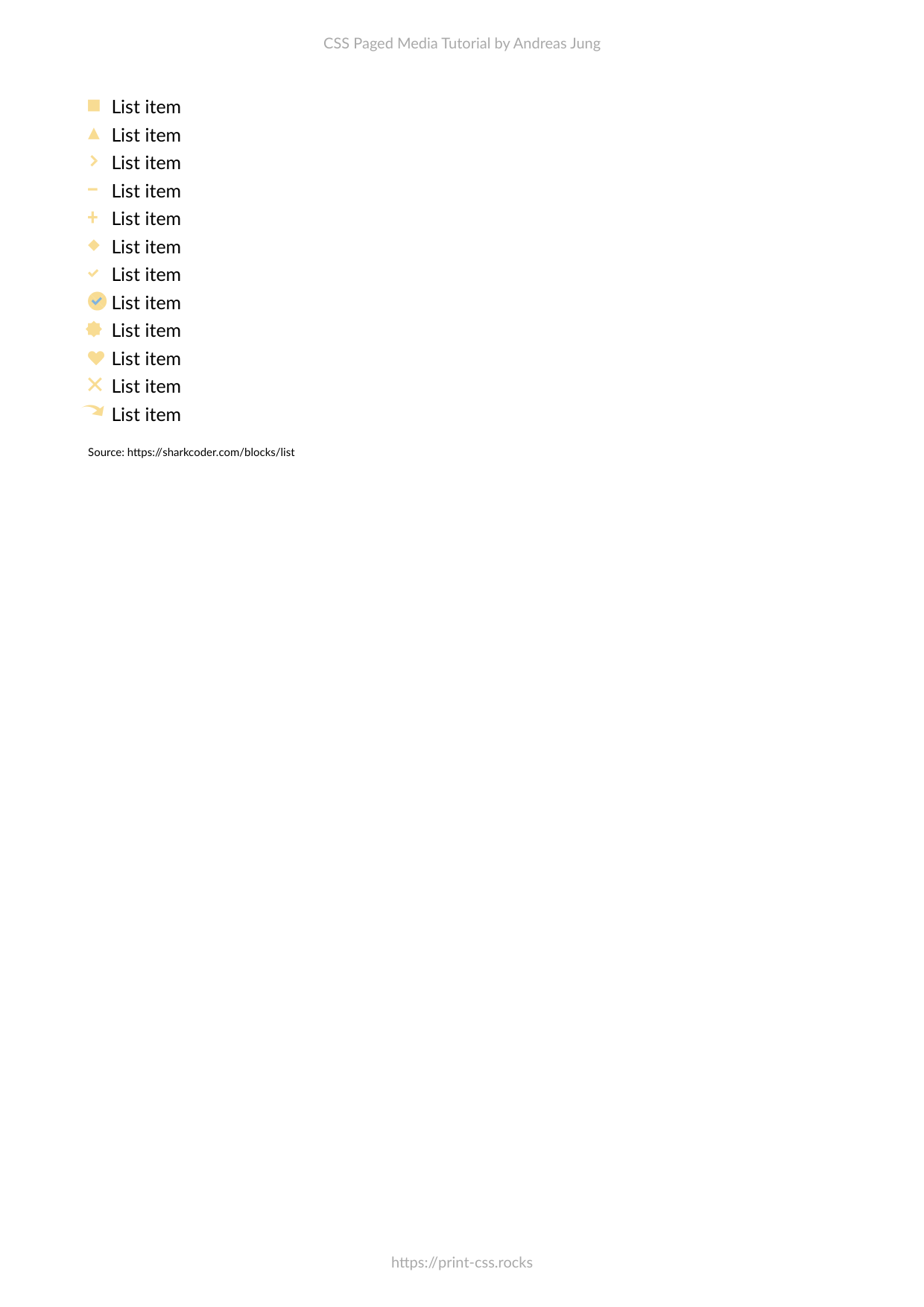
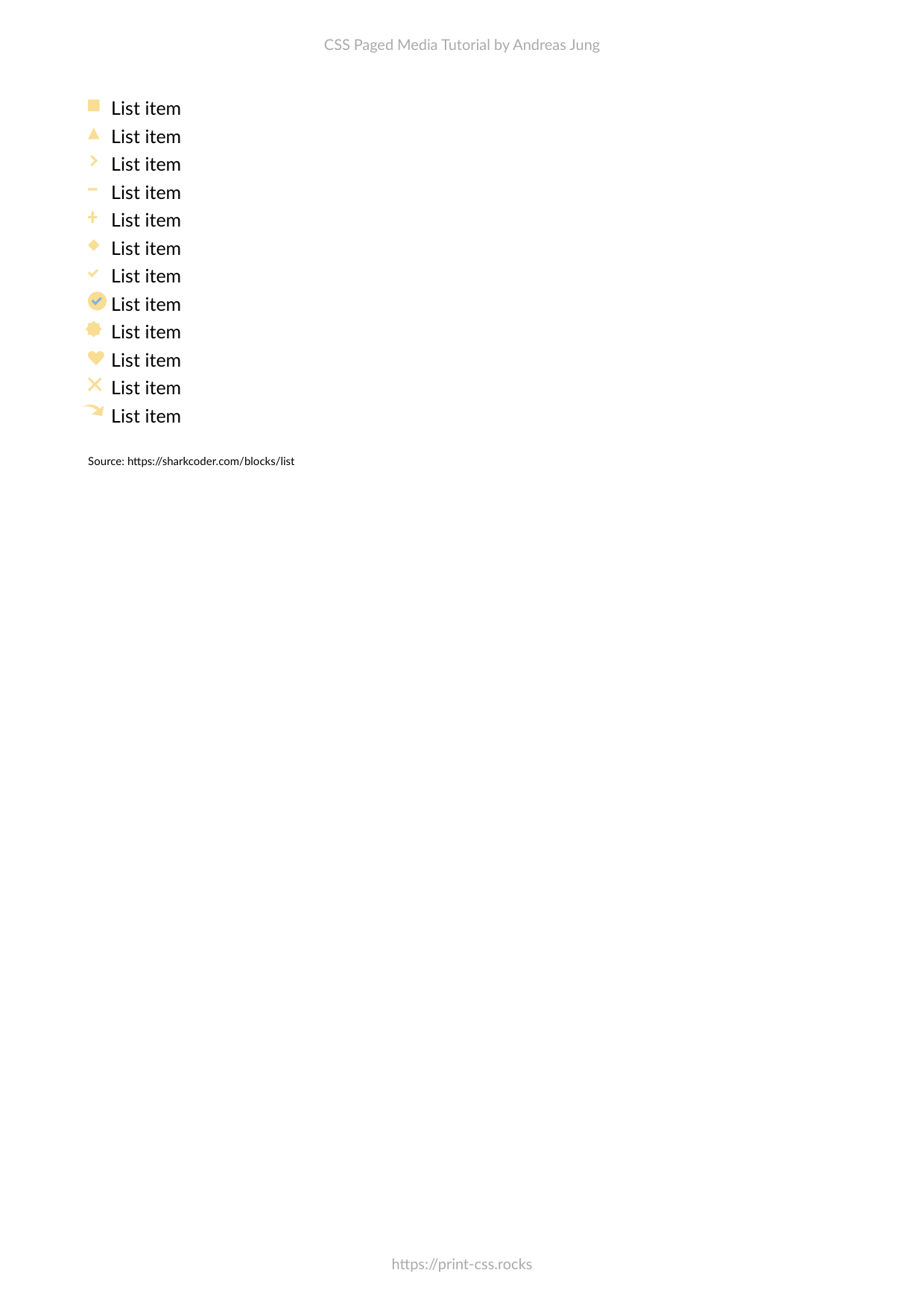
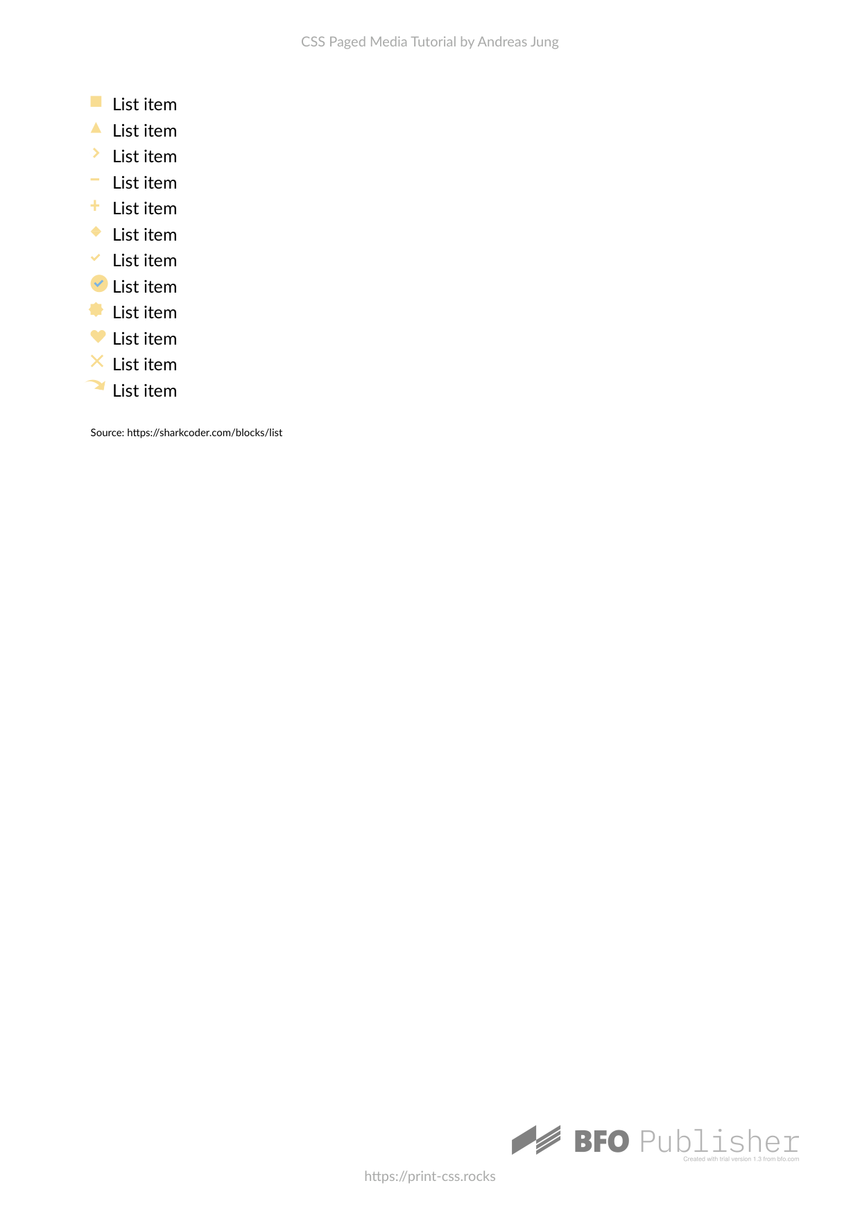
<ul class="list">
<li class="square">List item</li>
<li class="triangle">List item</li>
<li class="arrow">List item</li>
<li class="line">List item</li>
<li class="plus">List item</li>
<li class="diamond">List item</li>
<li class="checkmark">List item</li>
<li class="circle-checkmark">List item</li>
<li class="star">List item</li>
<li class="heart">List item</li>
<li class="cross">List item</li>
<li class="curved-arrow">List item</li>
</ul>
<span style="font-size: 0.6em; margin-top: 1em">
Source: https://sharkcoder.com/blocks/list
</span>
</body>
</html>
Stylesheet
ul {
    line-height: 1.5em;
    margin: 5px 0 15px;
    padding: 0;
    color: black;
}

li {
    list-style: none;
    position: relative;
    padding: 0 0 0 20px;
}

li.curved-arrow::before {
    content: "";
    position: absolute;
    width: 0;
    height: 0;
    left: 4px;
    top: 3px;
    border-top: 9px solid transparent;
    border-right: 9px solid #f9dd94;
    transform: rotate(10deg);
}

li.curved-arrow::after {
    content: "";
    position: absolute;
    border: 0 solid transparent;
    border-top: 3px solid #f9dd94;
    border-radius: 20px 0 0 0;
    top: 0;
    left: -5px;
    width: 12px;
    height: 12px;
    transform: rotate(45deg);
}

li.cross::before {
    content: "";
    position: absolute;
    height: 15px;
    border-left: 2px solid #f9dd94;
    transform: rotate(45deg);
    top: 2px;
    left: 5px;
}

li.cross::after {
    content: "";
    position: absolute;
    height: 15px;
    border-left: 2px solid #f9dd94;
    transform: rotate(-45deg);
    top: 2px;
    left: 5px;
}

li.heart::before,
li.heart::after {
    content: "";
    position: absolute;
    left: 7px;
    top: 5px;
    width: 7px;
    height: 12px;
    background: #f9dd94;
    border-radius: 50px 50px 0 0;
    transform: rotate(-45deg);
    transform-origin: 0 100%;
}

li.heart::after {
    content: "";
    position: absolute;
    top: 5px;
    left: 0;
    transform: rotate(45deg);
    transform-origin: 100% 100%;
}

li.star::before {
    content: "";
    position: absolute;
    left: 0;
    top: 5px;
    background: #f9dd94;
    width: 10px;
    height: 10px;
    text-align: center;
    transform: rotate(0deg);
}

li.star::after {
    content: "";
    position: absolute;
    top: 5px;
    left: 0;
    height: 10px;
    width: 10px;
    background: #f9dd94;
    transform: rotate(45deg);
}

li.circle-checkmark::before {
    content: "";
    position: absolute;
    left: 0;
    top: 2px;
    border: solid 8px #f9dd94;
    border-radius: 8px;
}

li.circle-checkmark::after {
    content: "";
    position: absolute;
    left: 5px;
    top: 5px;
    width: 3px;
    height: 6px;
    border: solid #7eb4e2;
    border-width: 0 2px 2px 0;
    transform: rotate(45deg);
}

li.checkmark::before {
    content: "";
    position: absolute;
    left: 2px;
    top: 5px;
    width: 3px;
    height: 6px;
    border: solid #f9dd94;
    border-width: 0 2px 2px 0;
    transform: rotate(45deg);
}

li.diamond::before {
    content: "";
    position: absolute;
    left: 0px;
    top: 0px;
    width: 0;
    height: 0;
    border: 5px solid transparent;
    border-bottom-color: #f9dd94;
}

li.diamond::after {
    content: "";
    position: absolute;
    left: 0px;
    top: 10px;
    width: 0;
    height: 0;
    border: 5px solid transparent;
    border-top-color: #f9dd94;
}

li.plus::before {
    content: "";
    position: absolute;
    background: #f9dd94;
    left: 0;
    top: 9px;
    height: 2px;
    width: 8px;
}

li.plus::after {
    content: "";
    position: absolute;
    background: #f9dd94;
    left: 3px;
    top: 5px;
    height: 10px;
    width: 2px;
}

li.line::before {
    content: "";
    position: absolute;
    left: 0;
    top: 9px;
    width: 8px;
    display: block;
    border-top: 2px solid #f9dd94;
}

li.arrow::before {
    content: "";
    position: absolute;
    left: 0;
    top: 6px;
    height: 5px;
    width: 5px;
    border: 1px solid #f9dd94;
    border-width: 2px 2px 0 0;
    transform: rotate(45deg);
}

li.triangle::before {
    content: "";
    position: absolute;
    left: 0;
    top: 5px;
    width: 0;
    height: 0;
    border-left: 5px solid transparent;
    border-right: 5px solid transparent;
    border-bottom: 10px solid #f9dd94;
}

li.square::before {
    content: "";
    position: absolute;
    left: 0;
    top: 5px;
    width: 10px;
    height: 10px;
    background-color: #f9dd94;
}